I recently ordered two new crafting books from Amazon. My bookshelves are overloaded, and I’ve been working hard not to buy more books. I’ve been really good about going to the library, instead, and I’ve become much pickier about which books I actually buy.
As one of my few recent purchases, then, I had high expectations for Melanie Testa’s new book, Inspired to Quilt. Initially, I was disappointed when I flipped through the book. Yes, I am a craft-book “flipper”; I look at the pictures first, check out the project instructions, and only read the large chunks of text when forced to (see the second half of this post for some thoughts on this issue of reading). I tend to jump into a project before I really understand the ideas behind it, because I’m so reluctant to actually READ the book.
Anyway, I was disappointed because it seemed that most of what Testa includes in her book are techniques I already know about: stamping and printing with thickened dyes, for example.
But then my eye caught a few intriguing words here and there: “layering,” “organza,” “freezer-paper stencils.” I kept looking at the wonderful photos of Testa’s work and wondering how she got those lovely effects. I knew there had to be more to this book than initially meets the eye.
As it turns out, Testa actually provides quite a bit of information about how she creates her art quilts, but it’s not laid out in a simple, step-by-step project format. Instead, much of the information regarding design, inspiration, and experimentation that Testa loads into the book can be found by carefully reading the text.
Don’t get me wrong: Testa provides a LOT of step-by-step direction for adding imagery to art quilts: creating monoprints, stamping dyes onto fabric with hand-made stamps (which she tells readers how to make), applying soy wax, using freezer-paper stencils and masks, and many more. I’m familiar with most of these techniques, so I didn’t find much new information there.
However, when I forced myself to slow down, start at the beginning, and read the book, I indeed found myself being “inspired to quilt.” My sense is that Testa wants to both provide people the tools (in the way of techniques) they need to create art quilts, but also the ability and desire to design art quilts. She wants to avoid having people reproduce HER work. Instead, she wants to inspire them to produce their OWN work.
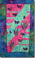
The other thing I really like about the book is that each of the photos of her work is accompanied by a short description of the techniques she used to create that piece; even if she doesn’t give us a step-by-step process for recreating her pieces, she does provide road maps that show us how she got to where she was going.
I’m glad that I bought this book. Not only is it a valuable addition to my library, but it’s helping me in my never-ending quest to slow down and be patient.
To summarize then, here a few pros and cons of Melanie Testa’s new book, Inspired to Quilt:
Pros
- High-quality, slick pages with high-quality photographs of Testa’s work
- Loads of information, both “buried” within the text and in a step-by-step format
- Coverage of several different dyeing techniques: direct dye painting, monoprinting, stamping, working with soy wax, using stencils and masks, and more
- Inspirational ideas about how to layer imagery on fabric to create art quilts
- Encourages experimentation and “rule-breaking”
Cons
- Few step-by-step “projects”
- Important information is sometimes buried within the text, so getting the most benefit from the book requires careful reading.
And now, what do LEGOS have to do with this post? Well, here’s the story:
I am a technical writer by profession. Most of my writing provides instructions for people who need to perform a task quickly and efficiently. A few years ago, I took a workshop on minimalist writing, which is, essentially, providing only the information people need, when they need it.
As part of the workshop, we were organized into groups and given a simple task: using the provided instructions, we were to assemble a small Lego tow truck. The “winner” of the contest would be the group who correctly assembled the tow truck in the shortest amount of time. Everyone had the same assignment and the same Lego parts. What we didn’t know is that each group had very different instructions.
The first thing I noticed as my group worked to assemble the tow truck is that we skipped any text in the assembly instructions. Instead, we went straight to the illustrations. If we couldn’t determine the next step in the process from the illustration, we backed up and read the instructions.
My group finished first, not because we were any smarter or more mechanically-minded than the others, but because we were fortunate enough to receive the “best” instructions. It turns out that, every time the instructor taught this class, the group that received the same instructions we did assembled the tow truck first. These instructions had very clear illustrations, supported by clearly formatted and concisely written step-by-step directions. The group that finished 15 minutes or so after us had instructions with fewer and less clear illustrations, and less clearly-written directions. The group that never finished had instructions with NO illustrations, text that was formatted only in paragraphs, and lots of “background” filler information sprinkled in among the directions (long, rambling passages on the the history of Legos, for example).
Now, here’s the really interesting part. It turns out that people read according to what their goal is. If it’s to perform a task as quickly and efficiently as possible, they “read” just like our group did: going straight for the illustrations, then to the numbered steps or bullet points for clarification. On the other hand, if people are reading to educate themselves and really learn something, as many of us did in college, for example, we’re more likely to read long passages of text (think about the way college-level textbooks tend to be written).
Unfortunately, we’ve become both a much more impatient society, as well as a more visual one. People claim that reading is actually on the rise, and point to the increased use of the Internet, and particularly the enormous popularity of blogs. But pay attention to your own reading habits: I’d be willing to bet my lunch money that very few of you have read this post all the way through. More likely, some people dropped in and, seeing no pictures, left immediately. Others skimmed the text, looking for the pictures or the “important points,” and slowed down only when they got to the “pro” and “con” bullet points above. Then, they resumed skimming, and perhaps lost interest before reaching the end.
What about your own reading habits in craft books, on blogs, or on web pages (I’m not counting books such as novels here, since they assume from the beginning a different motive for reading)?
- Do you go right for the pictures, and read the surrounding text only when the picture interests you?
- Do you look for the visual formatting cues to “important” information: bullet-dots, numbered lists, quote offsets?
- Do you skim the text, looking for points of interest, then go back and carefully reread only when the topic seems sufficiently interesting?
I know I do. But sometimes I wonder how much I miss this way. I wonder whether I’m overloading myself with information, but skimping on the more thought-provoking reading experiences that require attention and patience. If we’re all doing the same thing, what are the short- and long-term effects of this way of reading on our culture? On our verbal and visual literacy?
Framing this in term of my craft books, I’m wondering whether what I’m looking for when I initially skim them is the short-term “project” that I can jump into, rather than a longer-term learning experience. Is this one factor that holds me back in being able to design and produce the thoughtful work I hope for?
If you HAVE made it all the way to the end of this post, I’d be interested in hearing your thoughts on this subject. Leave a comment and let me know what you think.


